Bringing Clarity and Trust to Online Medicine Ordering
UI/UX Designer
Healthcare
4 weeks
A redesigned app and lots of learning
Overview
Sayacare is an online pharmacy that sells affordable, double-tested generic medicines. I genuinely liked the idea same quality but at way lower prices I studied the experience, ran a quick survey, and redesigned the friction points, this case study captures how the core flows were transformed for clarity and trust

What I initially Thought (My Hypothesis)


Understanding the Users 🔍
I didn’t have access to Sayacare’s actual customers, so I reached out to people I could reach
mostly 20–28year olds who order medicines online.
Not a perfect user group, but enough to spot meaningful patterns.
Research (Survey and Interview)
I kept research light but focused:
Online survey with 60 participants
3 interviews with users who buy medicines online

How often do you order medicines online?

Have you ever felt unsure which medicines require a prescription?

What would make you trust an online pharmacy more?

How much do you trust online pharmacies to deliver safe and authentic medicines?
Insights I got…
The patterns were clear and aligned closely with my hypothesis:
The Core Problem🎯
"How do we make Sayacare’s medicine ordering experience easy understand
and easy to trust? "
After combining my initial observations with user insights, I narrowed the scope to four major issues:


User Flow & Structure
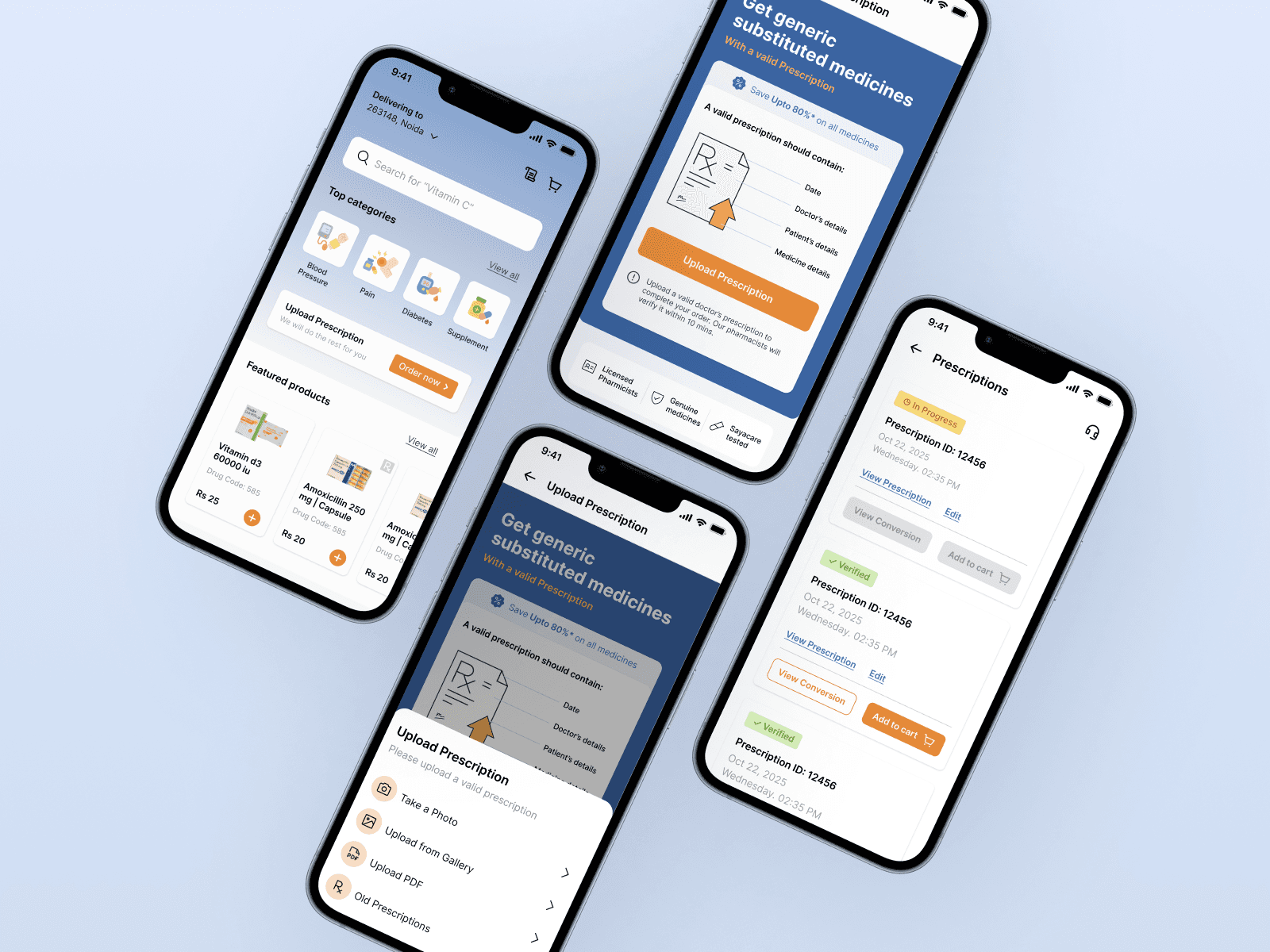
After identifying key friction points in Sayacare’s existing prescription upload process, I restructured the entire flow to reduce user confusion and decision fatigue.

Early Explorations
Before moving into structured flows and UI, I usually explore quick ideas on paper. These rough sketches helped me understand what needed simplifying, how users might move through the prescription flow, and how trust cues could be surfaced naturally.

Low Fidelity Explorations
Design Solutions🎨
Clarity Around Prescription Requirements
To remove confusion around prescriptions, I redesigned the flow to make the entire experience more transparent and predictable for users:
Added an RX tag on medicine cards
Redesigned the prescription upload flow
Making Order process Clear and Stress-Free
After fixing the prescription flow, the next big friction point was the order experience. Users on Sayacare had no real sense of where their order was. The original flow felt flat, text-heavy, and disconnected from the emotional side of buying medicines where clarity matters the most.
Clear order status labels along with Verified tags

